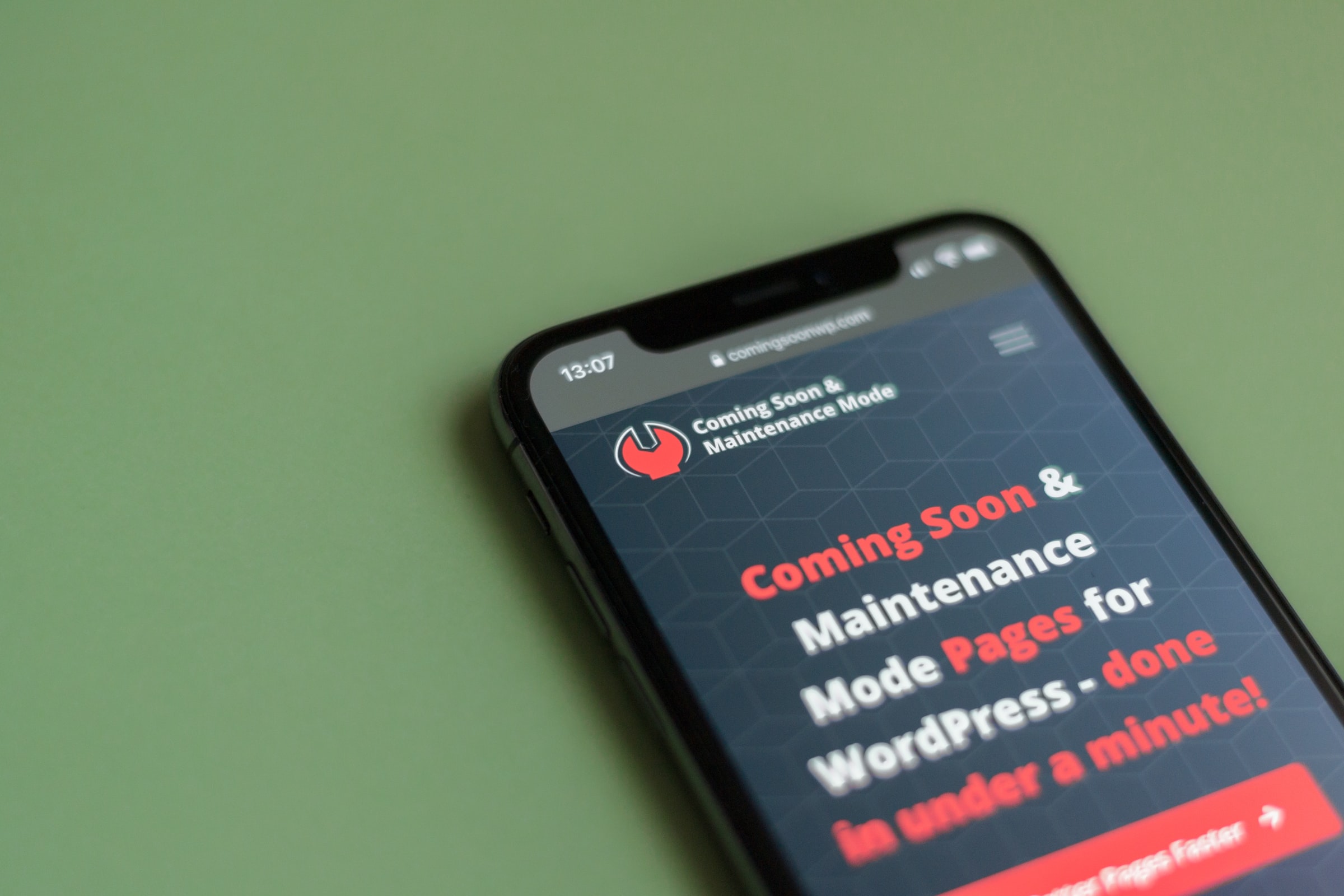
According to the Nielsen Norman Group, the literal definition of responsive web design “is a web development approach that creates dynamic changes to the appearance of a website, depending on the screen size and orientation of the device being used to view it” and is often abbreviated as “RWD”. Designing with this concept is one solution to the problem of devices with various screen sizes accessing your website and needing a user-friendly experience at the same time.
How responsive web design works
By asking a web designer to use responsive design, you are essentially asking them to create one website with one collection of HTML and CSS, but the website’s display and functionality will change depending on CSS breakpoints that the designer will set. More often than not, these breakpoints are set on the width of the browser and there are typically 3 main categories: mobile, tablet and desktop web browser. However, with the rise of larger monitors, and a multitude of smartphone sizes, these breakpoints can become more granular based upon if your website’s viewing complexity changes greatly with small increases or decreases in width. To successfully use breakpoints, you must first have a layout that lends itself to condensing. For example, if you lay out a website for a laptop that uses roughly 3 columns up and down the page, this design will be easy to condense to 2 columns for a tablet or 1 column for a mobile device. Responsive web design also considers other elements besides width, because sometimes large background photos, background videos or complex functionality may need to be hidden on certain sizes of devices (this can also be done using the breakpoints in CSS).
Why you should use responsive web design
By providing one set of code for a website, responsive web design makes maintenance to a website fairly easier. Whenever you need to change the display of content for a certain device, all you need to access is one, singular code base. As well, Google started using mobile-friendliness in its indexing of websites in search results starting in 2017, so if you want to improve your search engine optimization and ensure you are not deterring traffic from your site, responsiveness is a quality to consider. Remember that your website is built to meet the needs of your audience, so by providing expected interactions, like being able to redirect to calling a phone number that you can click on in a mobile site only, your site will be better set up for success.
When to use responsive web design
Responsive web design suits informational websites well, as content prioritization is at the forefront of the design. A lot can be viewed from a desktop browser, but needing to think of a solution to also see plenty of information on a smaller mobile screen is one of the core principles of this web design style. Responsive web design may not be for you if your website is heavily reliant on sophisticated functionality as transforming widths will not solve your problems across device types. Remember, too, that since the same amount of code is being sent to all devices, if your website relies heavily on speed performance, then RWD may cause your website to load slower in some cases (as opposed to adaptive design).
Whether responsive web design is the correct choice to tackle the user-friendliness of your website design or not, we should remind ourselves frequently that our websites should be as usable and customer-centered as possible. If you are looking for a web design team to address responsive web design needs, reach out to the team at HostGo that has been providing excellent customer service, top-of-the-line web hosting, and professional web designers since 1999.


